Campaign Lit: "Bad Apple"
Today I have another example of campaign literature to share. I'm pleased with all of the literature we've produced for this campaign, but "Bad Apple" is my favorite.
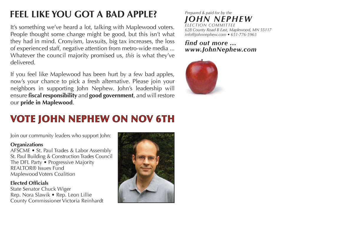 Even before I decided to run for city council, I met a lot of Maplewood residents who would admit to me, sometimes rather sheepishly, that they had voted for one or more of our present council majority. When I began door-knocking, I met a lot more. To say these folks had "buyer's remorse" is an understatement; feelings ranged from disappointment to anger and feelings of betrayal, of being deceived and used for other agendas than these voters had thought they were supporting. People who had felt some dissatisfaction with the old order had thought it might be good to shake things up a little bit -- but what has happened is not at all what they bargained for.
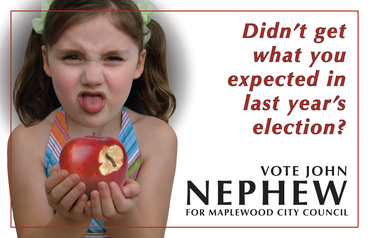
I wanted a campaign mailer that would tap into this sentiment, but I also felt it needed a light and whimsical touch, to transform feelings of anger and bitterness into laughter and hope for a better future through this year's election. We needed something that acknowledged voters' negative feelings about Maplewood's situation, but did not wallow in it, and humor seemed like the best approach.
Michelle and I talked about a few different visual concepts. The right image can communicate an idea much more quickly and effectively than a lot of text -- and candidates can't rely on getting a long attention span between the mailbox and the recycling bin. I proposed that we use a little girl with a grossed-out expression, and Michelle's idea of the wormy apple as the source of the grossness was visually perfect and also inspired fun turns of phrase. Our friends' daughter Zoe turned out to be the perfect model for the image as well, I think.
When we showed early drafts of the mailer to people and they reacted by instantly laughing out loud, we knew we were on the right track.
Labels: campaign 2007


Post a Comment